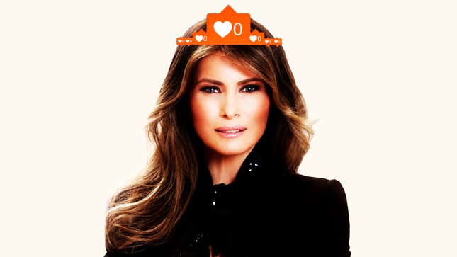
On July 4, 2018, someone working for the First Lady of the United States of America (or honestly, maybe it was Barron???) marked our country’s independence on Melania Trump’s Instagram account. Whoever it was didn’t post a photo of Melania hanging at the beach, or with a hot dog, or gazing at fireworks—that beautiful and violent manifestation of Melania’s struggle for freedom. No, they posted this:
There are a number of absolutely deranged things about this post. Where is that background image from? Why is it zoomed in and cropped that way? Why does the graphic as a whole seem...blurry? What’s with the text placement? Why am I suddenly so sad? WHO THE HELL MADE THIS?
The strangest thing, though, is that this incomprehensibly bad graphic gram isn’t the first one the @FLOTUS account has posted. Not even close. Let’s gaze into the abyss, shall we?
For starters, this wasn’t even Melania’s first gram with flag art. Memorial Day got its own—arguably better?—iteration of “cropped American flag + text,” complete with the digital version of burning the edges of your school project on the Civil War.
And OK, to be fair, each and every one of us is guilty of overproducing our first few grams. But damn, whoever is making these is absolutely ALL IN when it comes to a sepia tone. They are cranking up the vignette tool like there’s no fucking tomorrow.
The next stop on our tour is a post for International Women’s Day, and nothing, absolutely nothing, says “Happy International Women’s Day!!!” like a sweat-stain-colored graphic. Seriously, this image manages to somehow smell when you look at it.
Many of Melania’s actual photos are also yellow-tinted, so I guess it’s just an aesthetic????? Some people love the Earlybird filter, I guess. Those people are beyond saving.
Is it just me or does this feel like a distress signal?
Was this made in Snapchat? Was it written by an alien? Is this background construction paper or papier-mâché? What does it all mean?
OK, this one is legitimately chilling:
My eyes hurt.
Is this a nightmare? Am I dreaming? Is it still the ‘90s?
Please, god, can someone just explain the thought process that went into this image choice? What am I even looking at here???
Finally, the most iconic graphic design work of all, the text art for the First Lady’s Be Best initiative, which the team deemed good enough to post TWICE IN A ROW.
These Instagrams are so bad that I want to believe Melania herself made them. But the truth is, someone on the payroll in the Trump administration has been tasked with this job and this is what they’ve come up with. Whoever you are, mystery graphic designer, I hope you continue to Be Best. It would be terribly off brand to be better.

